

Description
Product description
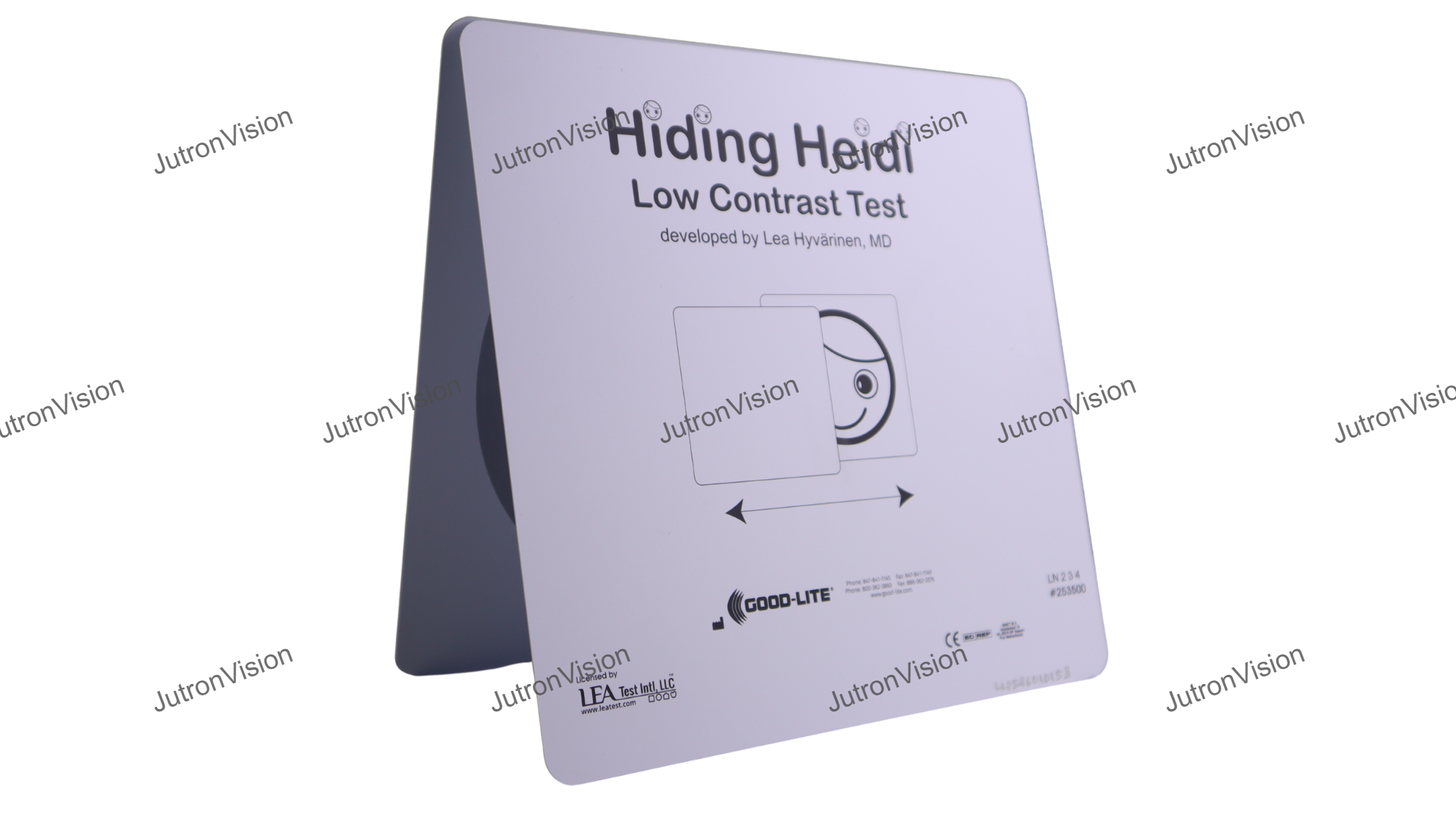
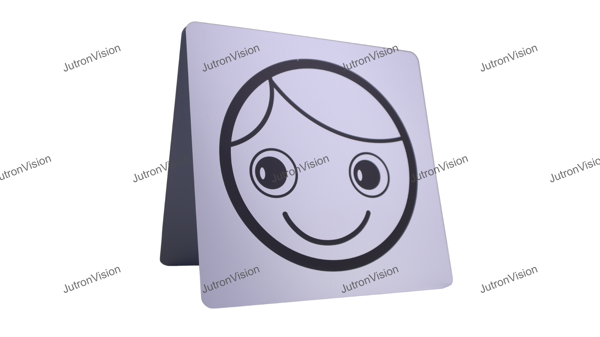
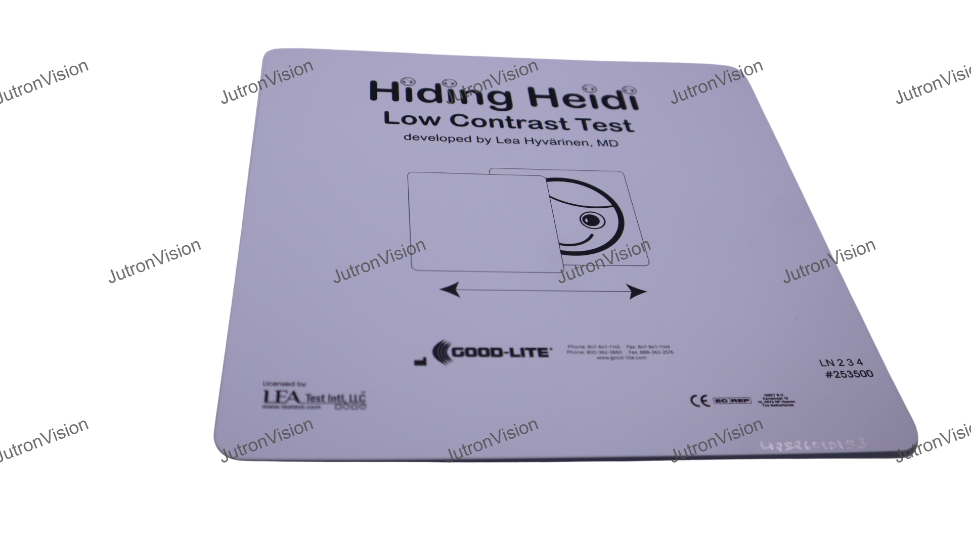
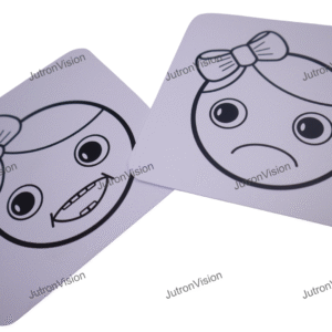
- The Hiding Heidi Low Contrast Face Test is a child-friendly screening tool for contrast sensitivity—the ability to see objects that don’t stand out strongly from the background. Instead of letters, it uses a simple Heidi face presented at progressively lower contrast levels, so even very young children can respond by looking, pointing, or naming. This makes it especially valuable for detecting functional vision problems that may be missed by standard high-contrast acuity charts, and for monitoring children with conditions that affect visual quality (not just sharpness).
- What it measures: Low-contrast vision / contrast sensitivity (how well a child sees faint targets)
- Why it matters: Contrast sensitivity impacts real-life function—faces, stairs, classroom materials, and low-light situations—even when acuity looks “normal”
- Kid-friendly response: Works for pre-verbal and pre-literate children using preferential looking or pointing
- How it’s used: Present face cards at a set distance and lighting → reduce contrast stepwise → record the lowest contrast level detected
- Ideal for: Pediatric clinics, early intervention, school screenings, and follow-up monitoring
- Helpful for: Neuro-visual issues, developmental delays, amblyopia follow-up, retinal/optic nerve concerns, and post-treatment tracking
- Best practices: Use consistent illumination and distance, avoid glare, and keep instructions simple and encouraging
- Care: Store cards away from sunlight/heat to prevent fading; wipe gently and keep surfaces flat and clean
| Topic | Details |
| Purpose / Target Users | • Infants, pre‑verbal children • Young children or patients unable to respond with letters, pointing, or verbal indication • Individuals with developmental or multiple impairments where standard tests are impractical • Also useful in clinical / research settings assessing contrast sensitivity in populations with limited |
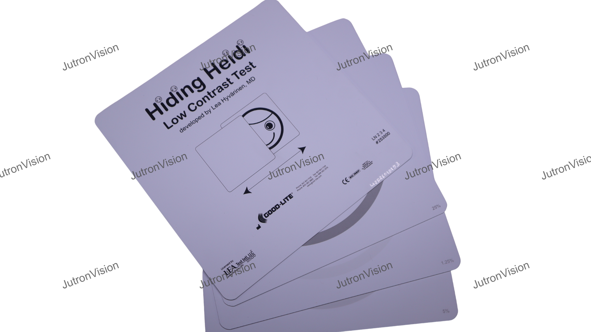
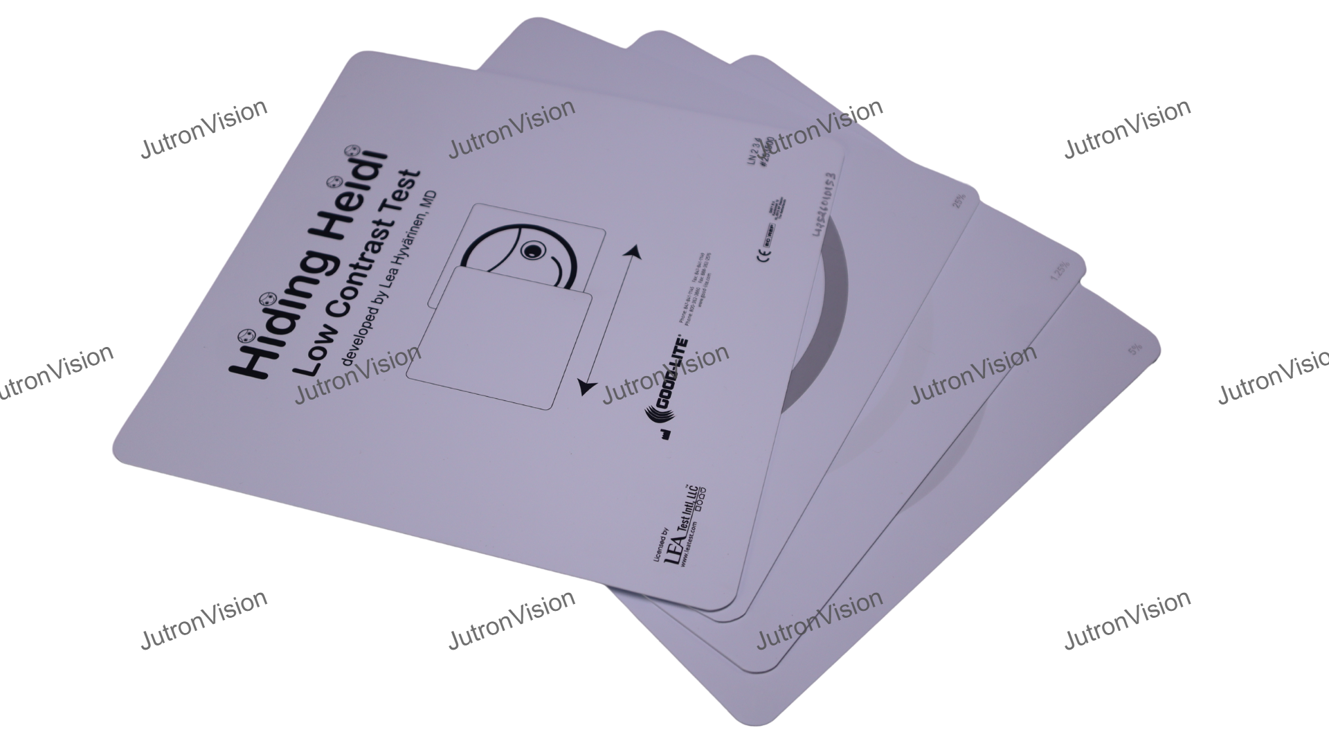
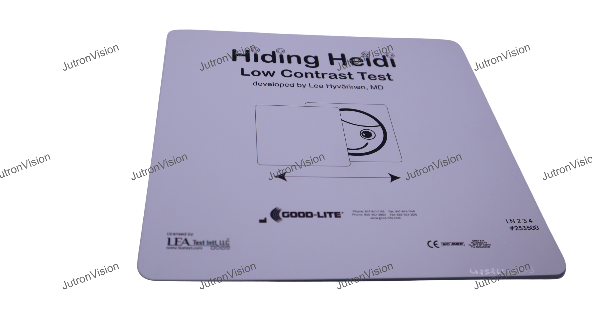
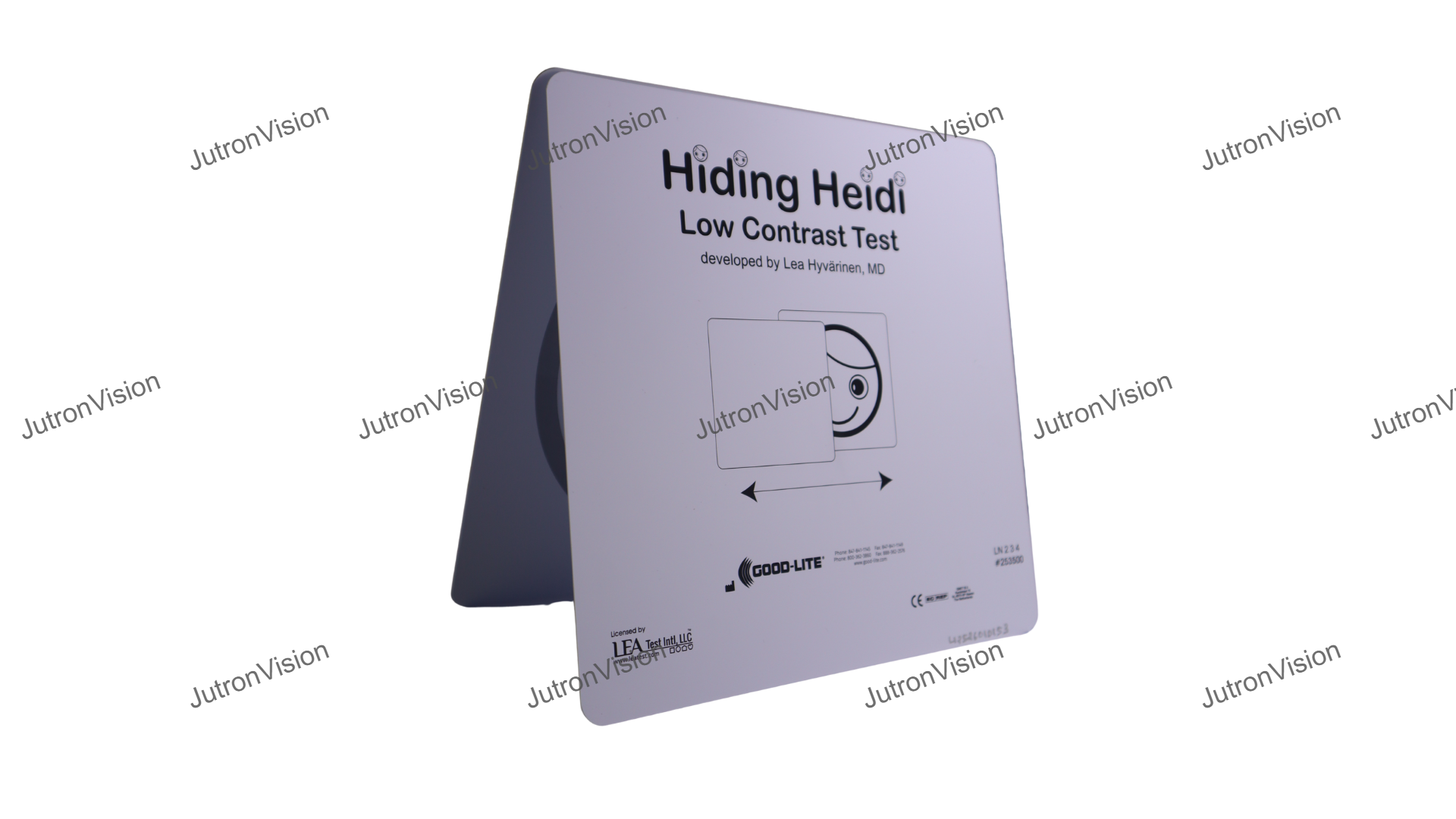
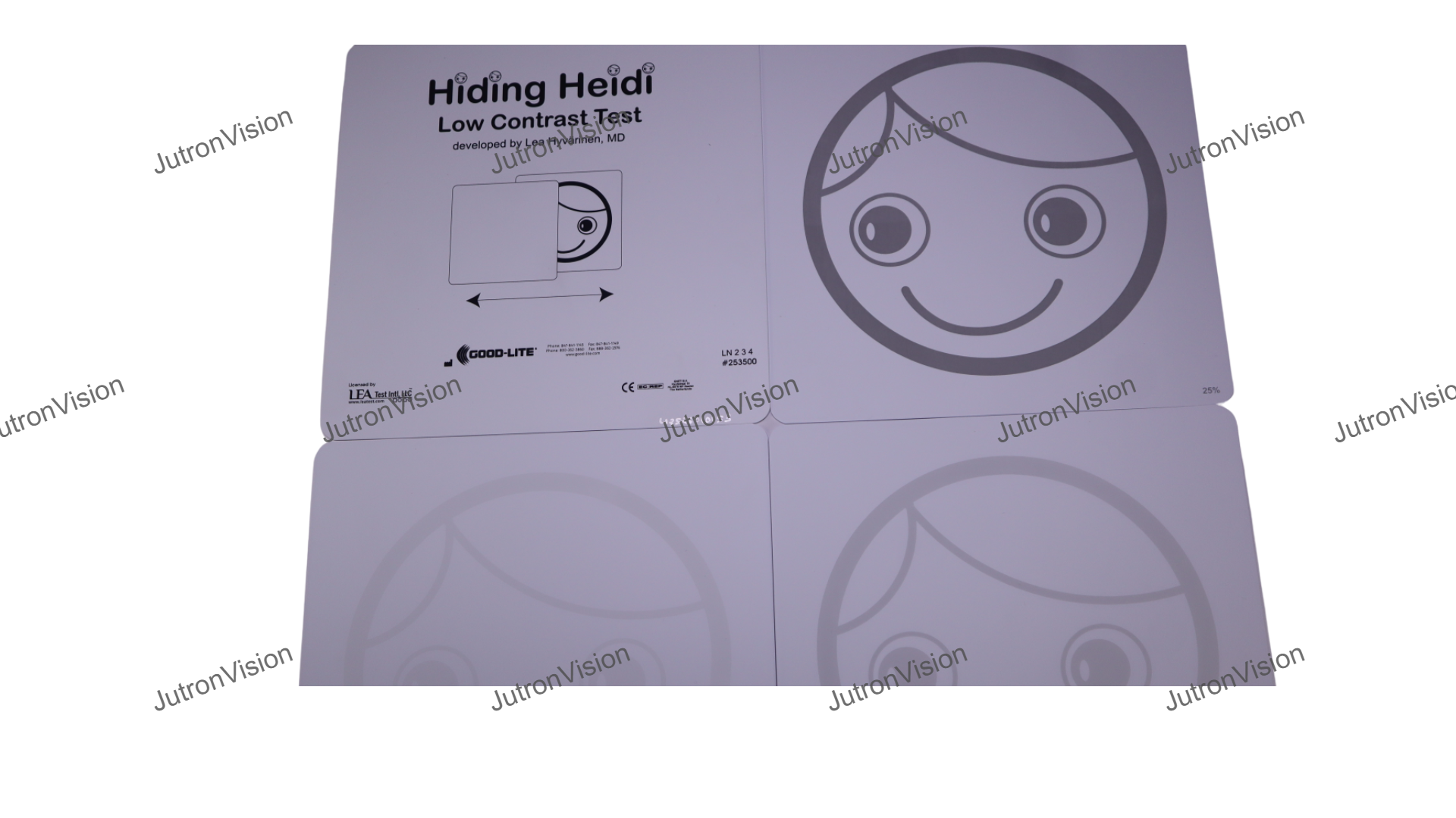
| Optotypes / Symbols | The stimuli are face images (“Heidi”) / facial features — a face pattern used as the target rather than letters or standard optotypes. Cards are printed at multiple contrast levels: black (100%), 25%, 10%, 5%, 2.5%, and 1.25% contrast. |
| Scaling / Spacing | it is about contrast detection rather than resolution limits. Thus, there is no scaling of line sizes or spacing akin to Snellen, ETDRS, or logMAR charts. |
| Range of Acuity / Line Sizes | The test is not a conventional acuity chart; it does not present multiple “lines” of varying size in a spaced layout. |
| Testing Distance | A recommended presentation distance is where the subject can respond to the highest‑contrast (100%) face card. Some sources suggest similar low contrast face tests being used at about 3 meters |
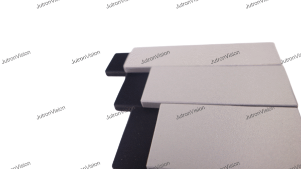
| Physical Size & Dimensions | Each card is 9″ × 9″ (approximately 23 cm × 23 cm) The set (double‑sided version) comprises 4 cards, printed on both sides to include the contrast levels. |
| Mounting / Display Features | The cards appear to be handheld / manual presentation cards rather than a fixed mounted chart or electronic display. The protocol involves presenting the test by moving a face card and a blank card (one blank, one stimulus) laterally (or vertically if nystagmus) in front of the subject, i.e. a “movement / forced choice” preferential looking type paradigm. |
| Included Accessories / Extras | The set includes instructions for use. Because it is double‑sided, the 4 cards include 6 contrast levels (3 levels per side) (100%, 25%, 10%, 5%, 2.5%, 1.25%) across the two faces. No additional accessories (e.g. mounting hardware, stands, backings) are explicitly stated.No electronic or automated features—completely analog. |
| Durability / Material Qualities | The cards are printed on a substrate suitable for handling, likely rigid or semi-rigid (cardstock) to permit manual presentation without bending. (This is inferred; explicit material is not stated in the sources I saw.) Because they are high‑contrast / low‑contrast prints, quality printing and stable inks are likely needed to maintain consistent contrast levels over time. No explicit mention of lamination, UV protection, or high durability in the product listing. |
| Usability / Marker of Quality | Strengths / usability features: Designed specifically for populations who cannot reliably respond in standard visual acuity tests (infants, nonverbal, multiple disabilities). Simple stimulus (face) is more engaging / recognizable than abstract letters or gratings in young or difficult populations. Use of multiple contrast levels provides a graded measure of contrast sensitivity rather than a yes/no. Double‑sided design is compact and efficient (4 cards covering many contrast levels) The large size (23 cm × 23 cm) helps visibility and ease of handling. |
Reviews
There are no reviews yet.